Design
Sketches
I kicked off the Design phase by conducting a Sketching Workshop. It was important to have each teammate contribute an idea to the re-design of the main dashboard as a starting point in order to brainstorm potential wireframes.
Original Site Map
We created a site map of the dashboard to analyze how service providers navigate the platform, add content, and engage with the athlete community. Most navigation elements had a single use, contributing to a cluttered interface.
Proposed Site Map
By integrating findings from the Tree Test and our firsthand experience navigating the existing mobile application, we formulated a revised site map.
Objective: to enhance the clarity of dashboard navigation functionality and to boost engagement with end-users via the mobile application. This was achieved through optimizing user flows to align with the mobile application's functionality and renaming these flows and functions accordingly.
Wireframes
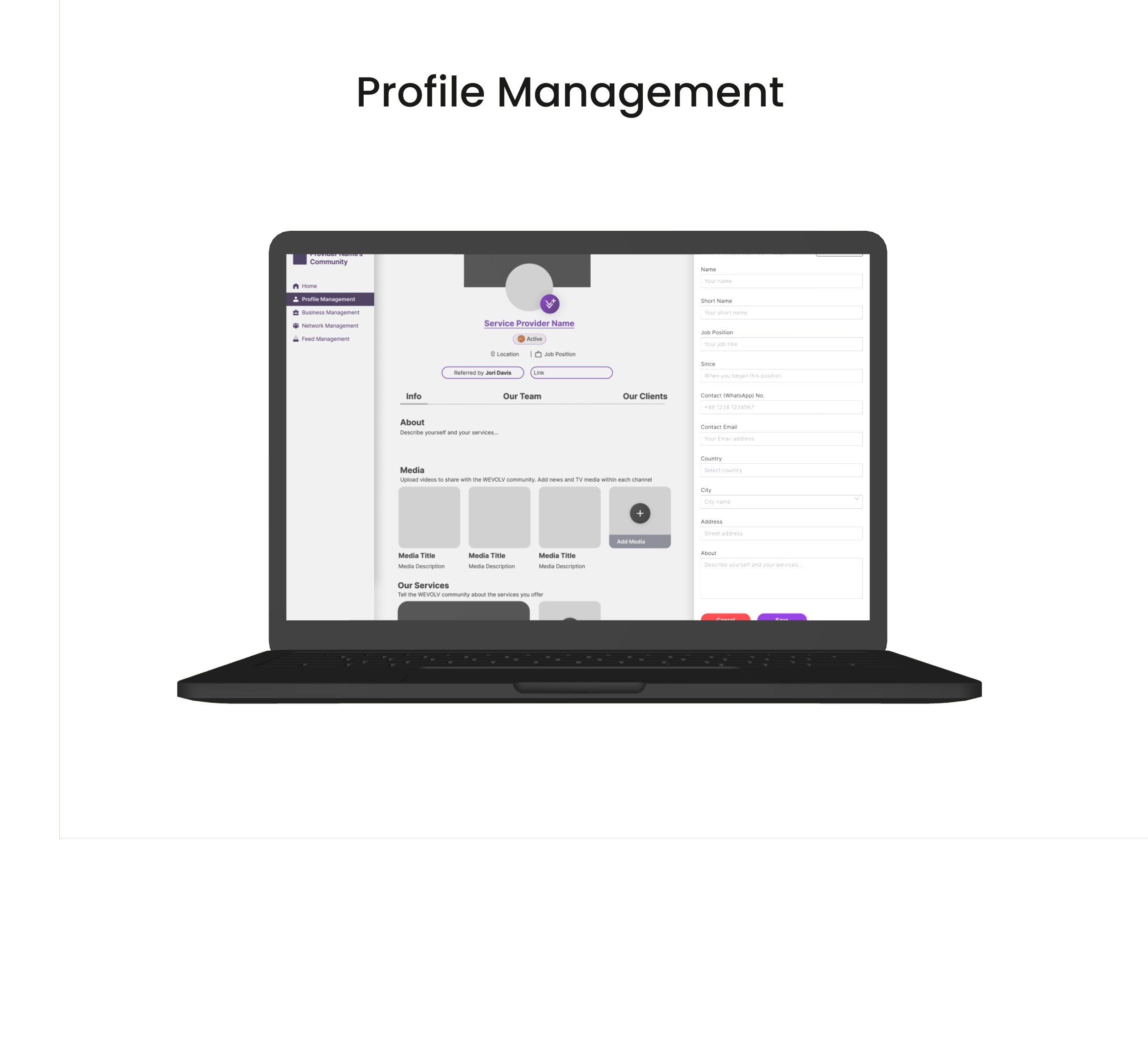
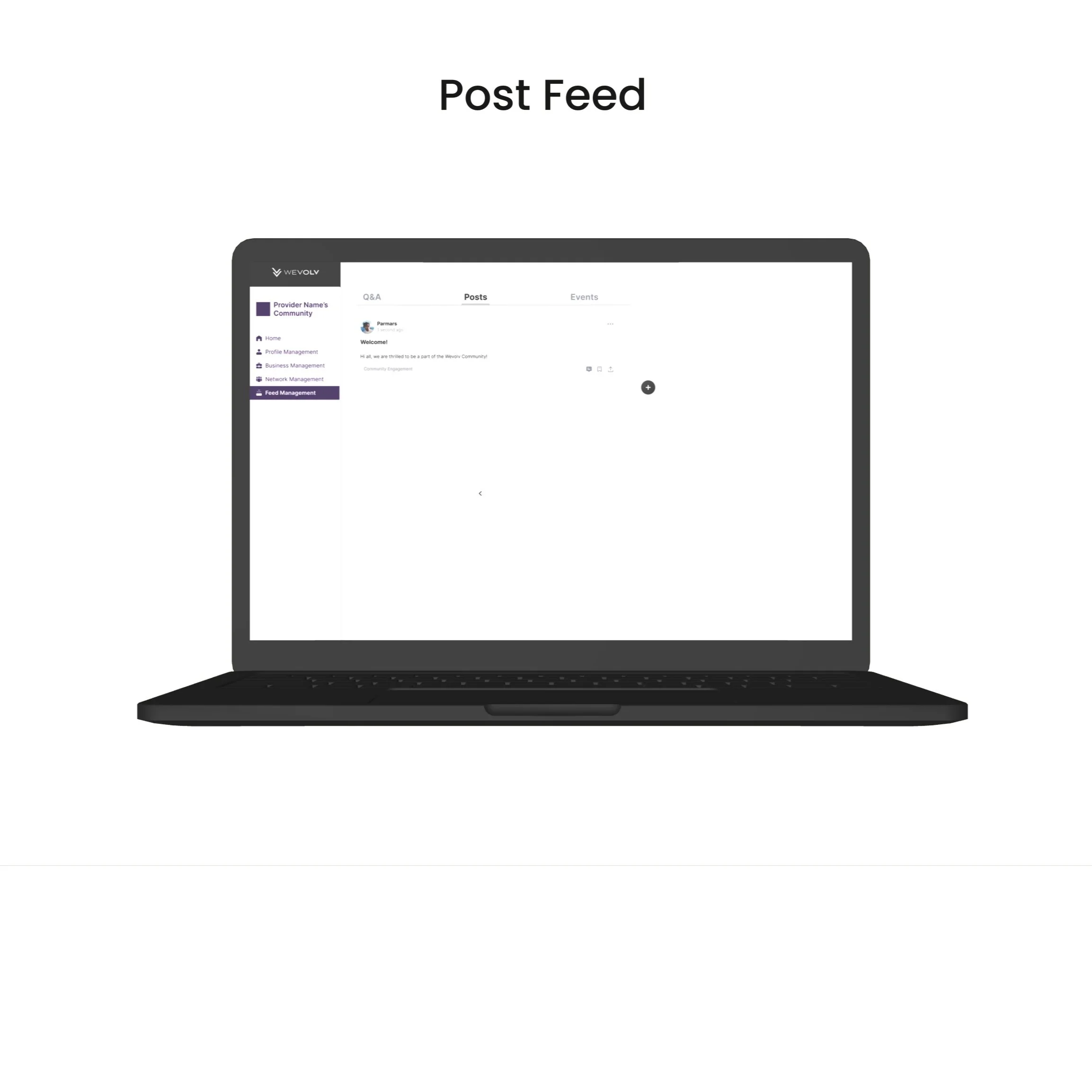
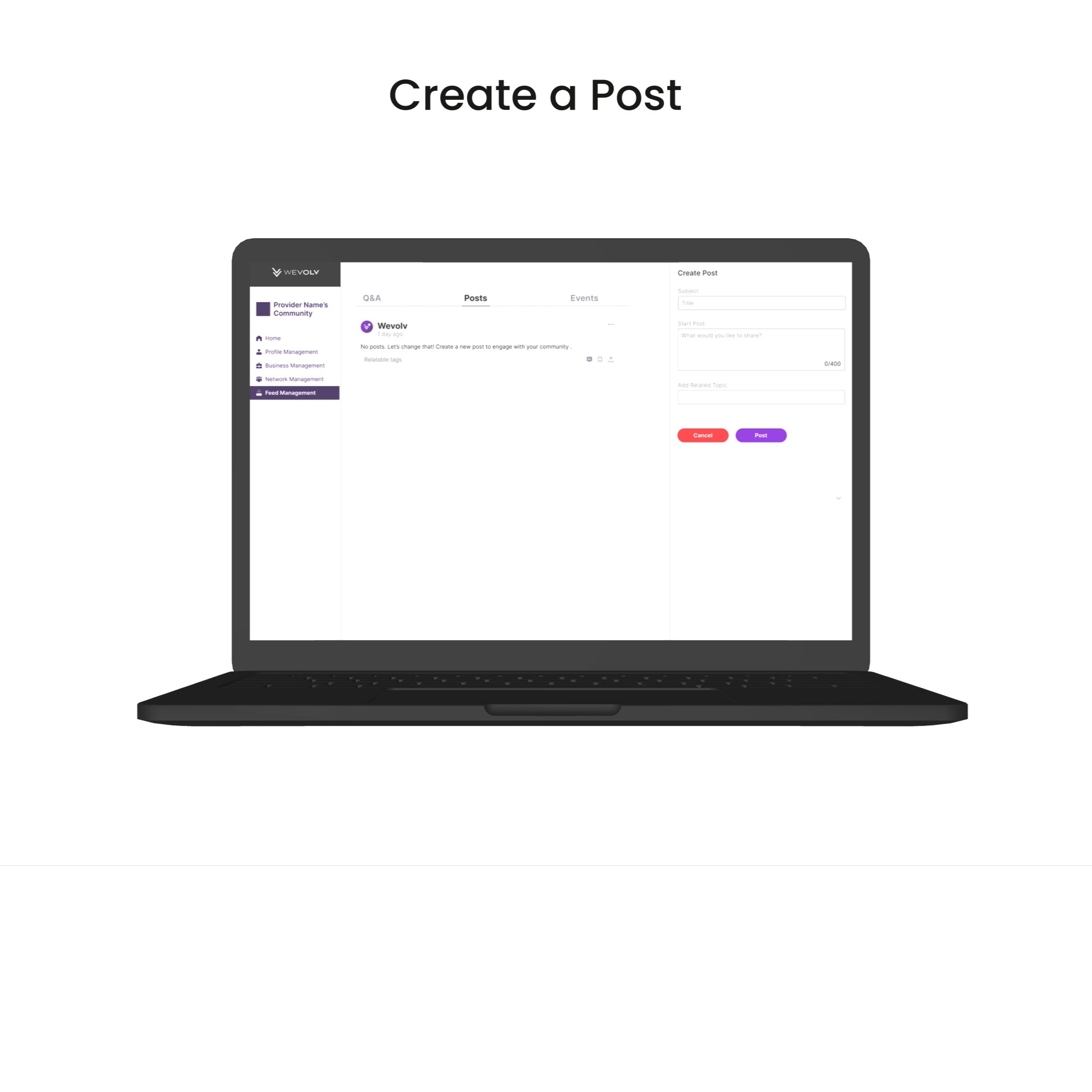
In Figma we developed wire frames for each flow.



UI & Brand Guidelines
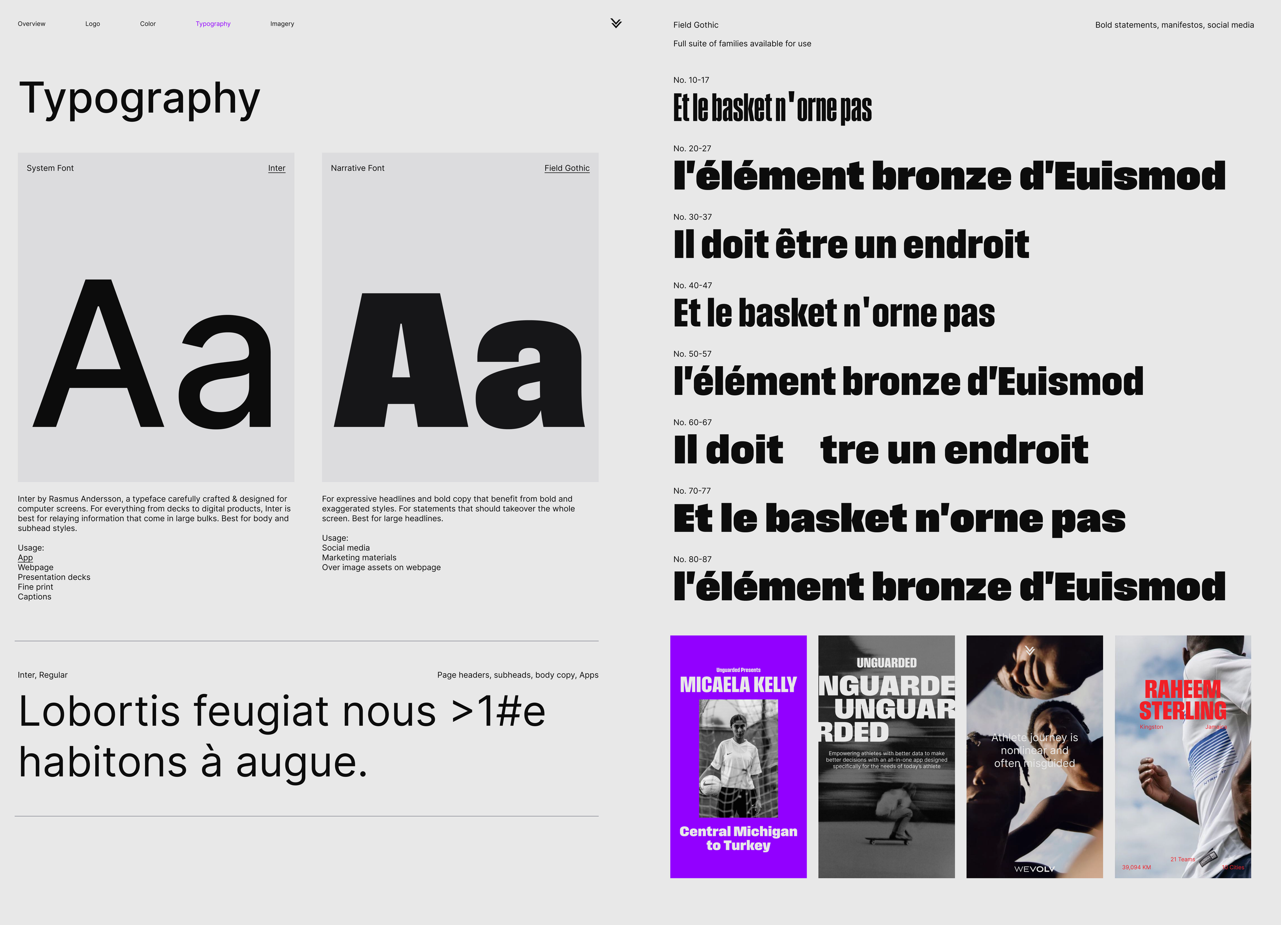
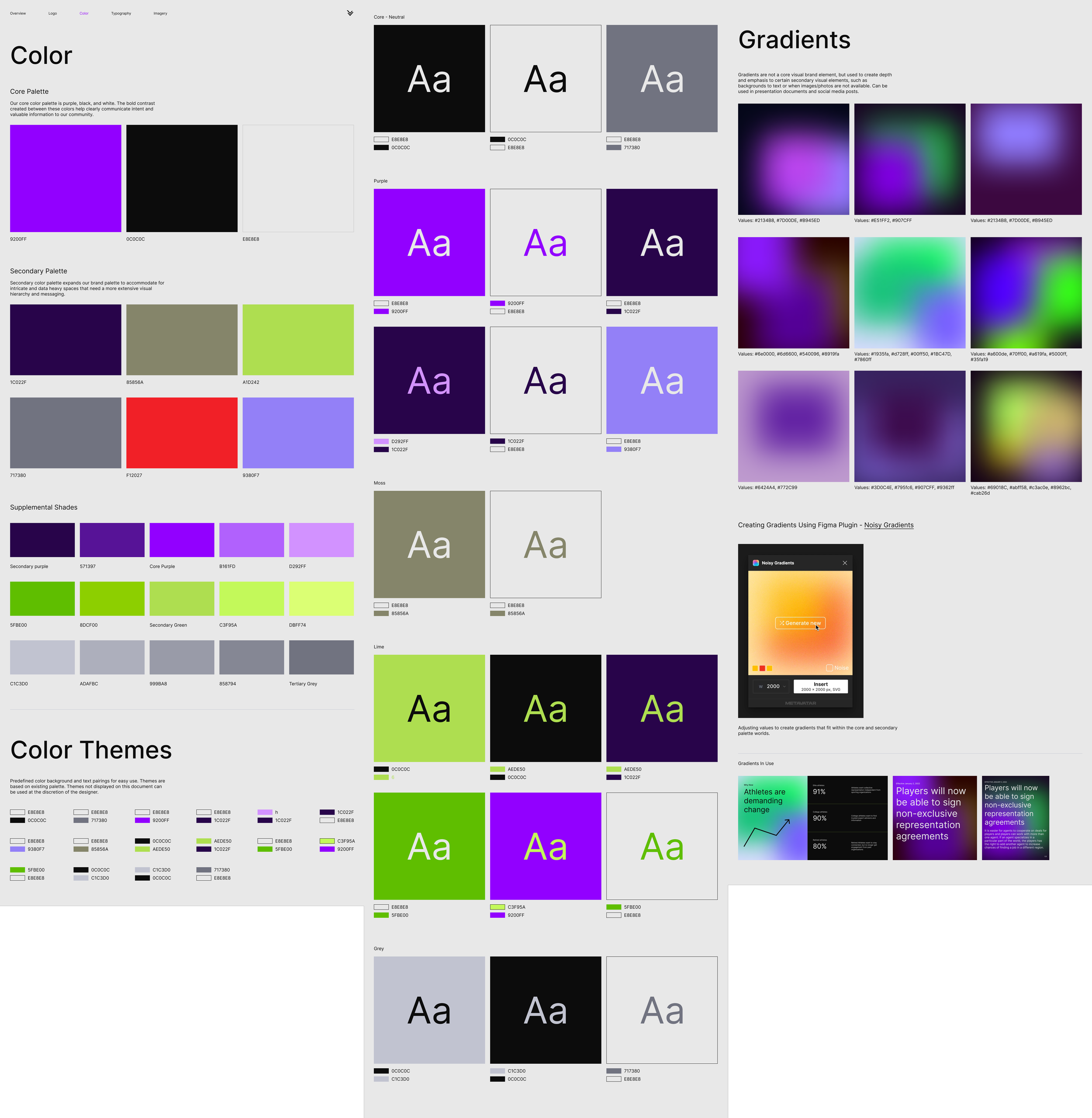
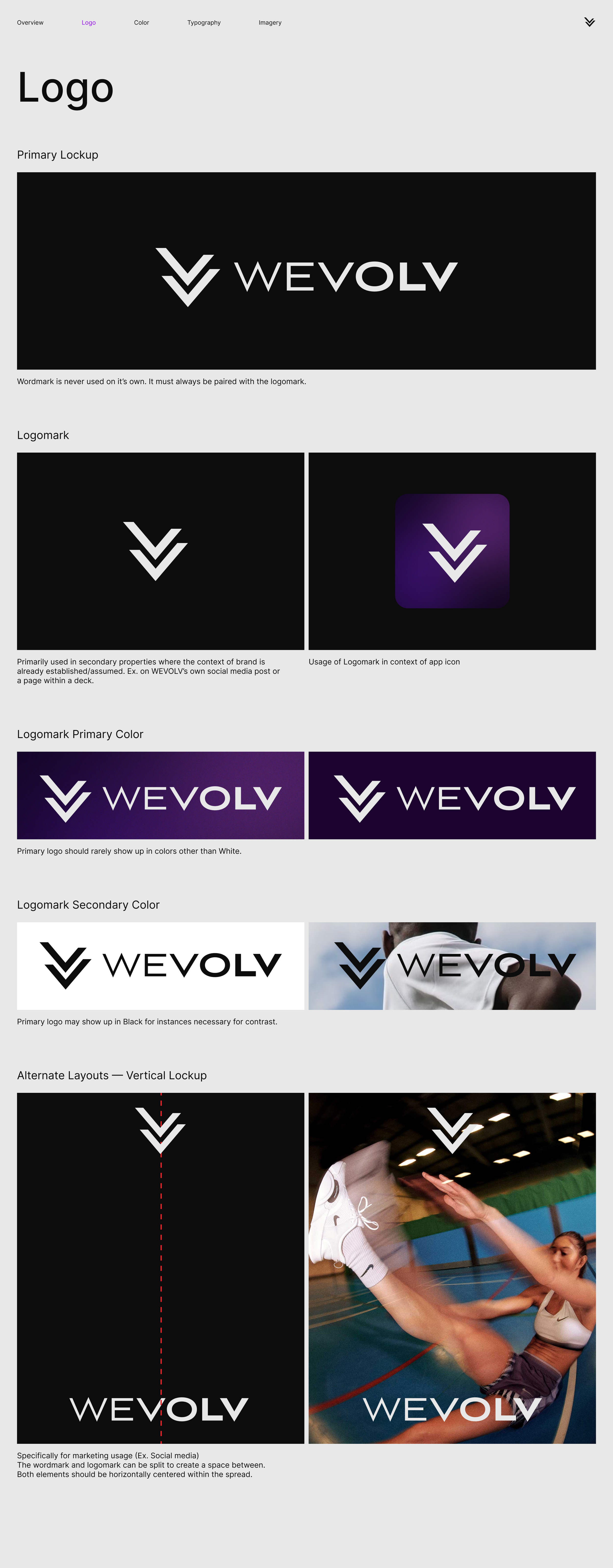
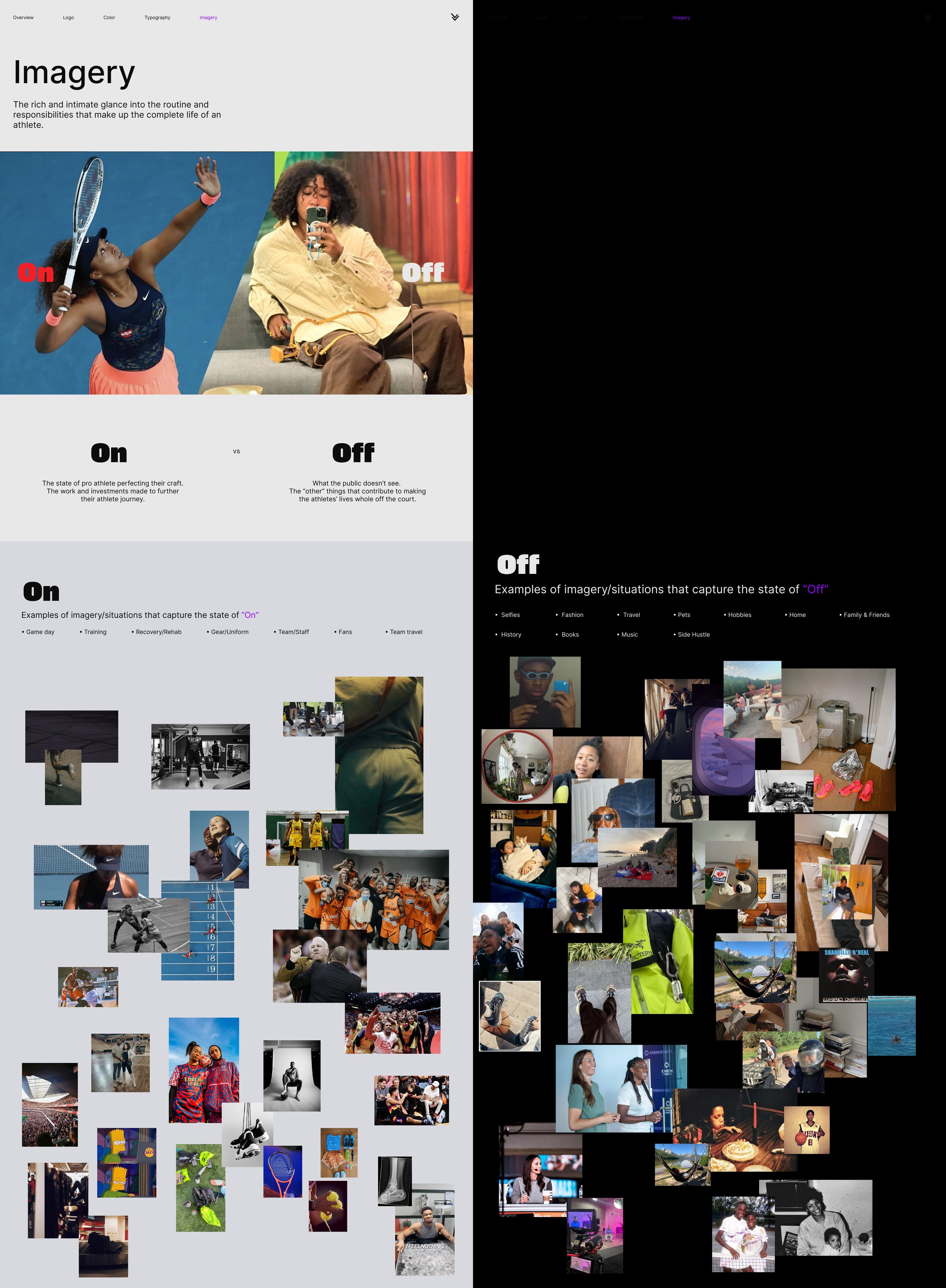
Our UI was as important to our design as our UX. We incorporated specific brand guidelines for design consistency across the Mobile & Web App.
Prototype
Created in Figma, we developed our high-fidelity prototype based on our user testing.


