Wevolv Web App Redesign
Improving Navigation & Accessibility for Service Providers to Connect with their Clients
I had the opportunity to lead the UX/UI re-design of Wevolv’s platform.
Wevolv is an online & mobile platform that helps professional athletes connect with reliable service providers like lawyers, therapists, and real estate agents.
SERVICES
Product Design
Web Design
INDUSTRY
SaaS
The Problem
The Service Provider professionals need an accessible user experience to engage with their athlete clientele within the Wevolv network.
The Solution
Web application re-design that improves the site navigation and UI of the Service Provider’s dashboard.
Research Findings
Due to the difficult navigation Service Providers are struggling to engage with athletes on the Wevolv Platform.
We conducted user research: Competitive analysis and user interviews to understand the needs and challenges of our target audience.
To explore each step of the research phase in-depth, click below to access the findings in more detail.
Competitive & Comparative (C&C) Analysis
Direct Competitors- Sport & Community platforms that support career & business networking.
Indirect Competitors- Network, lifestyle & resource sharing platforms.
User Interviews- Starting with how they create trust, engagement and community with their clients outside of Wevolv.
Goals:
Determine the goals, motivations & pain points of the service providers who work with athletes
Scope:
We conducted 3 interviews with Wevolv Service providers ages 40-55.
“Consistency & good communication. I’m happy to always do a consultation ahead of booking. I put my pricing out there right away. I don't [alter my pricing per client] or anything like that.”
“People that are interested in athletics have listened to my podcast and they've already familiarized themselves with me, and that's what helped them pick me as opposed to another consultant.”
“Building community for my business means that I can mass distribute relevant information”
Problem
Our users' needs were different from our original business goals.
We analyzed the data from our user research, reassessed our success goals (boost engagement and conversion rates), and created a Priority Matrix to help choose features based on urgency and effort.
The path forward became clear;
before an onboarding process could be complete, the Service Provider had to be re-designed.
Redefined Business needs:
Service Provider’s are struggling to engage with athletes on the Wevolv Platform due to the difficult navigation. Wevolv needs to enhance the Service Provider’s Dashboard experience in order to improve the navigation and increase service provider engagement.
Design
Initial sketches, to the user flows, wireframes and our mid-fidelity prototype.
To see the in-depth design process, click below.
Testing
We conducted moderated usability testing on our mid-fi prototype to test our solution.
Click Below to access our in-depth data derived from Tree Testing & Usability Testing with Service Provider Professionals
Key Features
Designed for consistency, personalization & user engagement.
Home Page - Consistency & Standards
Consistency between dashboard & mobile app by including the same format, layout & accessible resources
Profile Management - Personalization
Ability to personalize & manage user profile info directly on the dashboard.
Feed Management - User Engagement
Enables the user to access & engage with their online community through Q&A, Posts & Events.
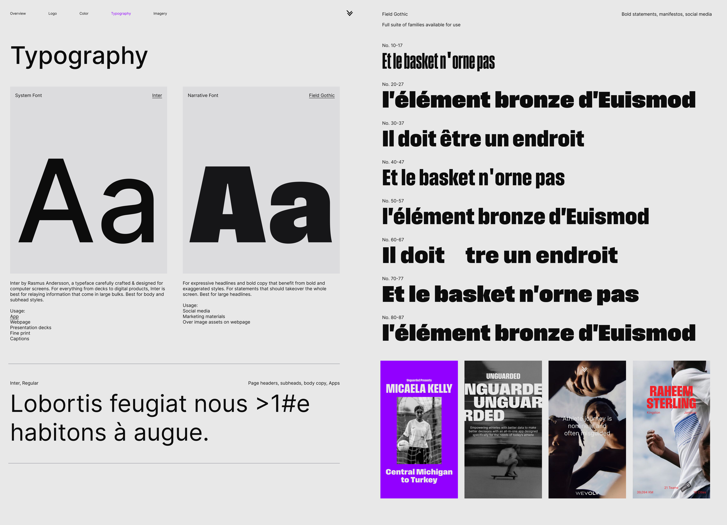
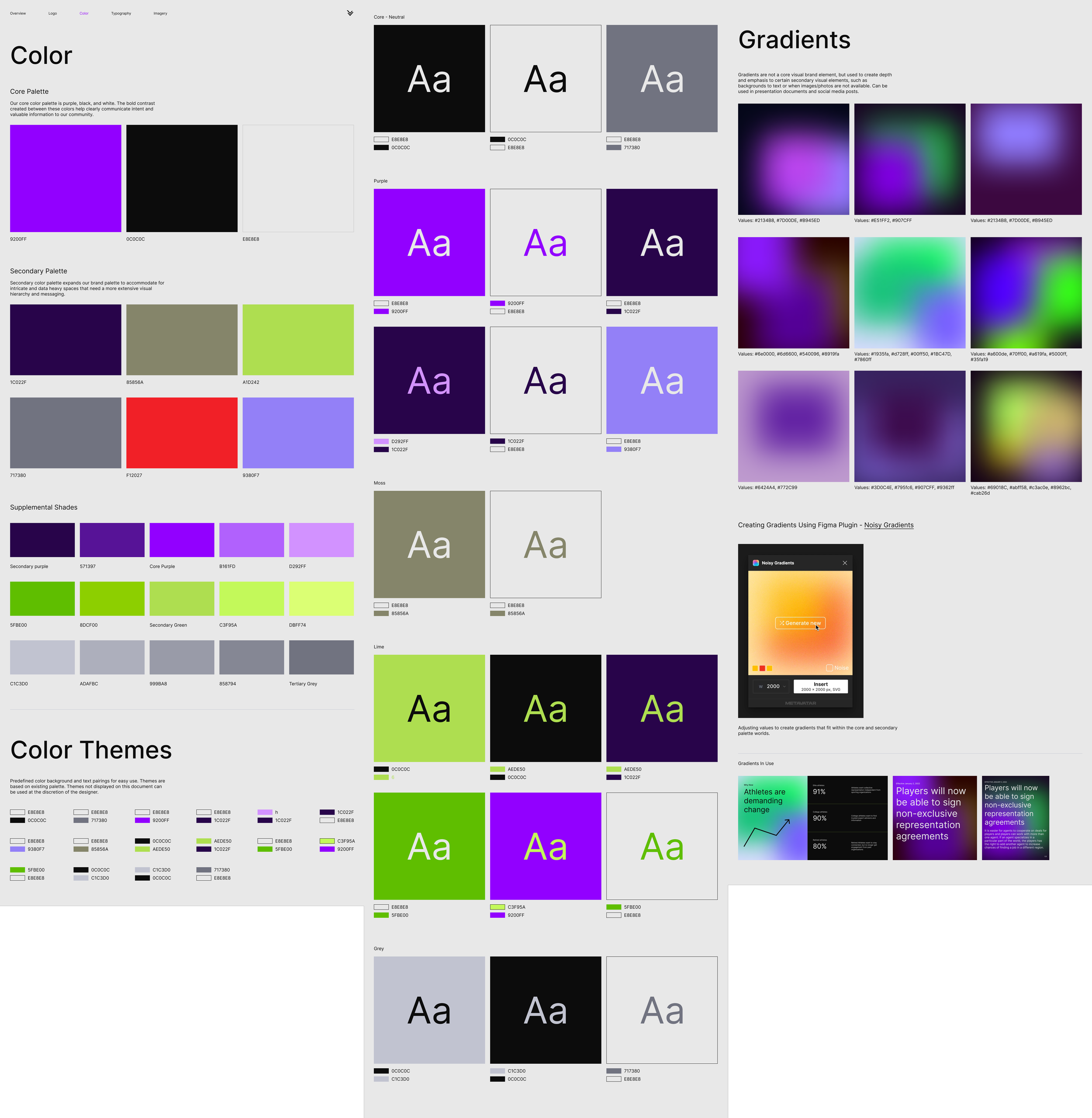
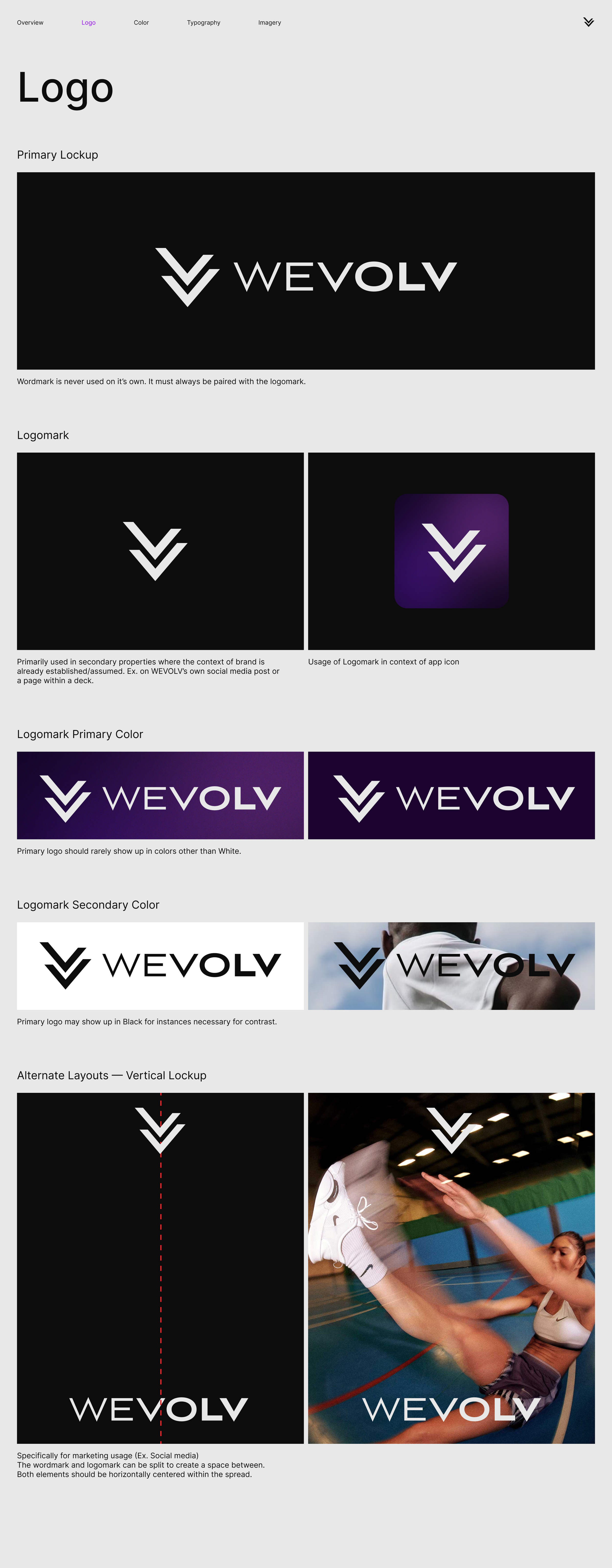
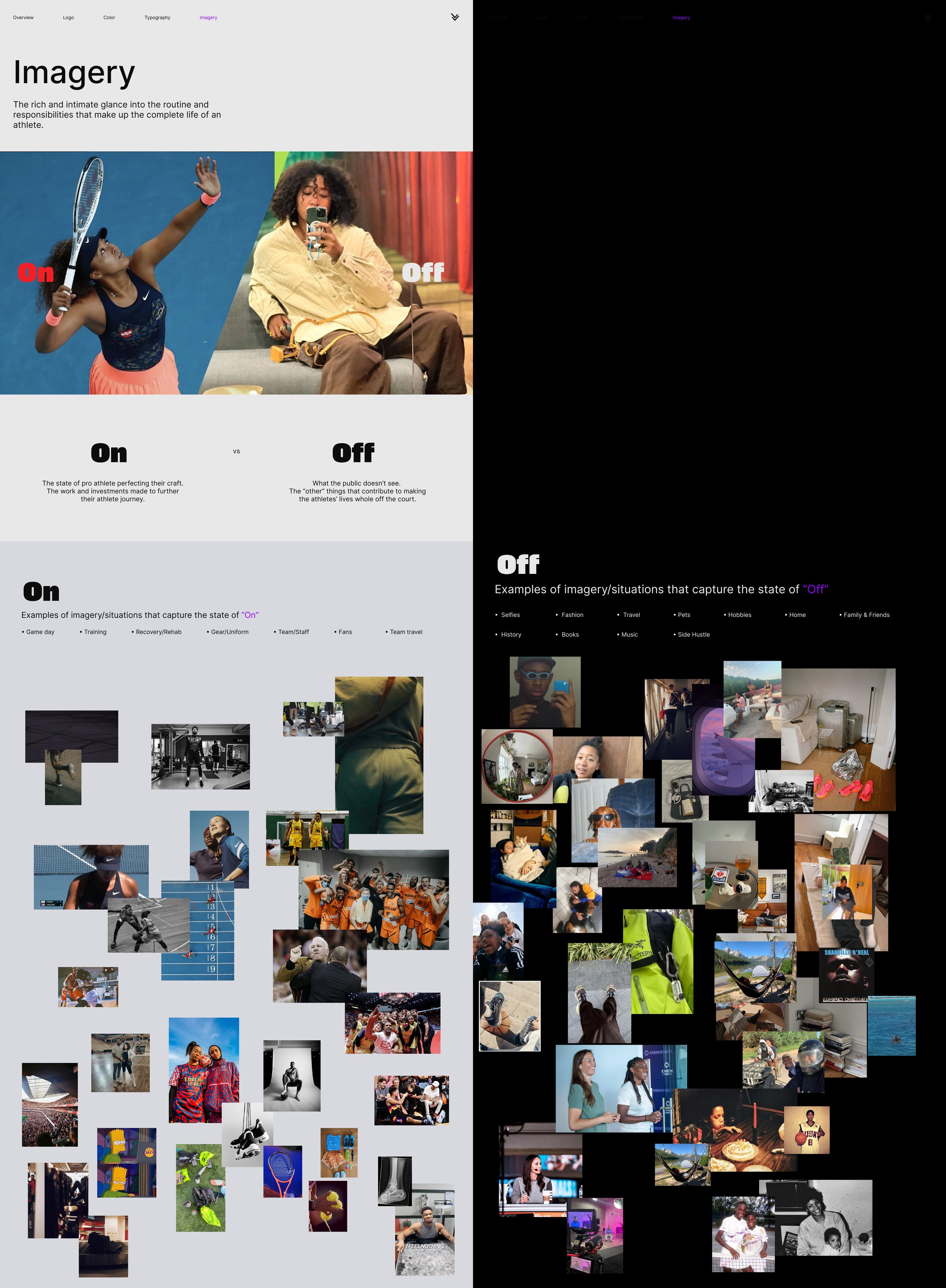
UI & Brand Guidelines
Incorporate design consistency across the Mobile & Web App.


Prototype
Created in Figma we developed our refined High-Fidelity prototype.
Developer Handoffs
Detailed handoff of precise measurements and annotations, for a smooth transition from design to development
Next Steps
Chat Feature - Private Messaging
Customer Success Agent and update tutorials & guides to support the Service Provider experience
Service Blueprint to support the onboarding process
Prioritize the Testimonials section within the design of the mobile application
Takeaways
We successfully delivered and tested three main outputs: a detailed prototype of our vision, a style guide for consistency, and organized handoff files for the client’s development team. During this time, I improved my prioritization skills by deciding what was most important to meet our goals. As Design Lead, I also developed leadership skills that allowed me to meet deadlines, support my teammates, and manage different ideas and expectations effectively.


